
I love when Pantone comes out with the color for the year as well as the different colors for each season. Emerald is the popular and most daring choice this season. According to Leatrice Eiseman, the executive director of the Pantone Color Institute, green is the most abundant hue in nature. The human eye actually sees more of it than any other color in the spectrum.
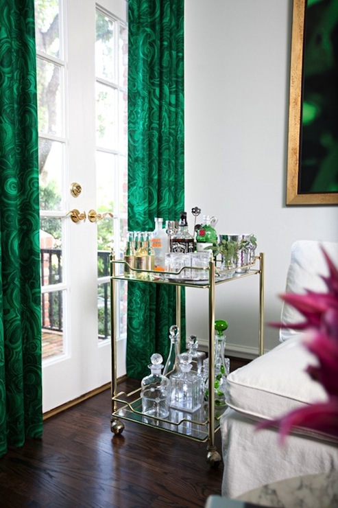
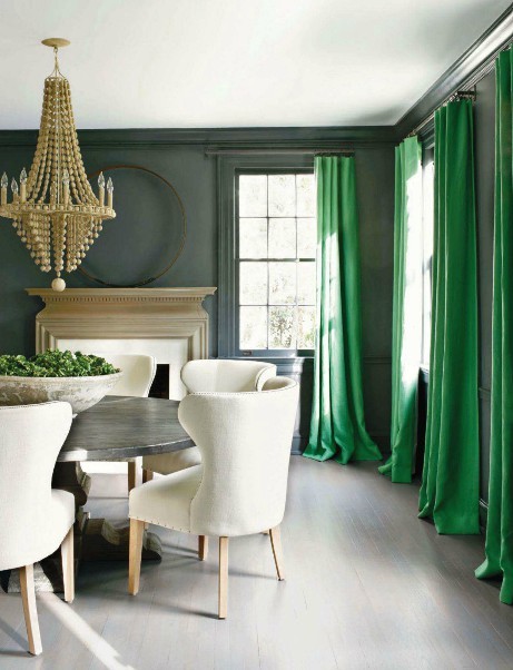
Source: la-belle-vie.tumblr.com via Julie on Pinterest
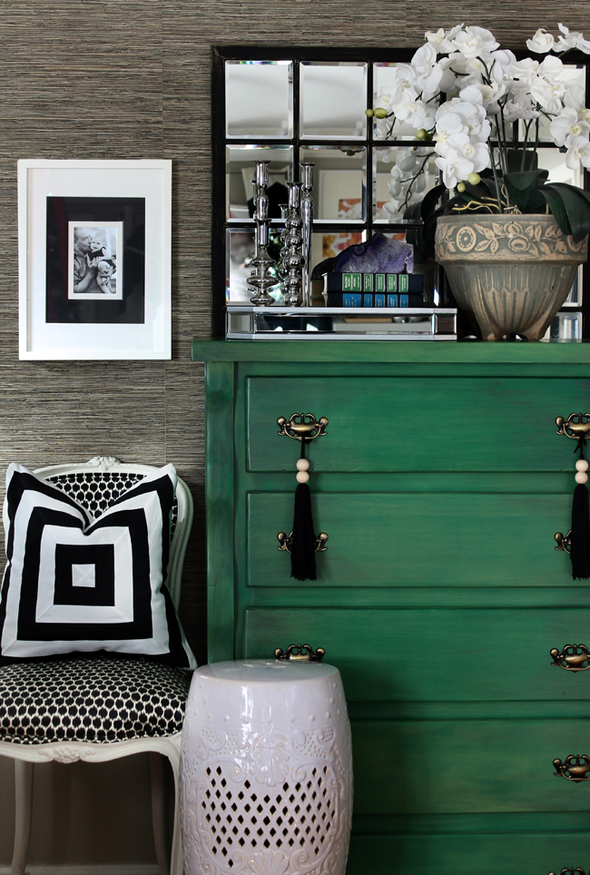
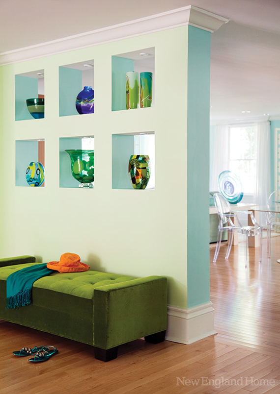
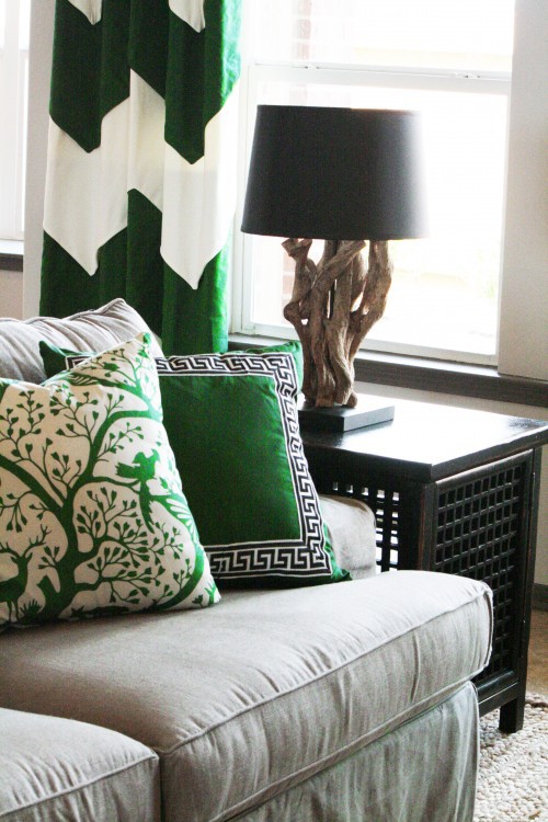
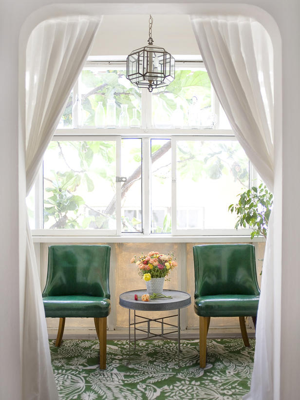
Source: konfetti.tumblr.com via Susan on Pinterest
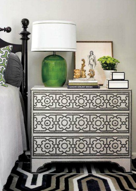
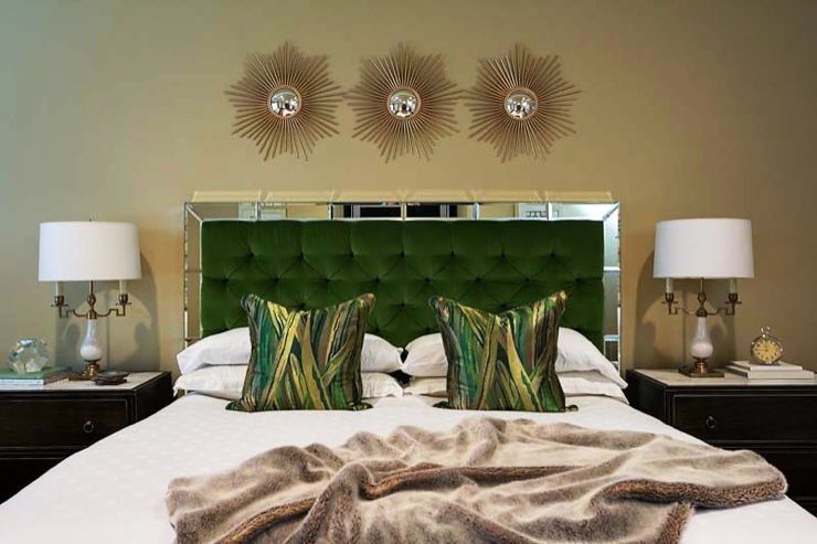
How to Use Emerald Green in Your Home
Emerald is a bold, saturated green, so the easiest way to bring it into a room is in small, deliberate doses. The inspiration images above show a few approaches worth borrowing: a painted dresser or chest as a single statement piece, emerald drapes or upholstery as a soft accent, and green paired with rose, pink, or neutral tones to keep the look balanced.
I have to say I admire the boldness of emerald and although my living room is painted a soft shade of green I don’t think I would be able to have such a bold color in my house. I am more of a “alloy” kind of girl. What about you?



I absolutely love green and this color is such an amazing shade. Although I do not use it in my decor, maybe I should rethink that next time we move. Those drapes in the second photo and the dresser in the 4th are devine!
ReplyDelete